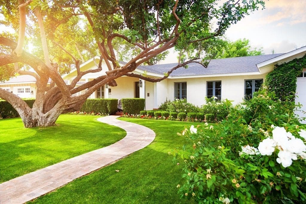
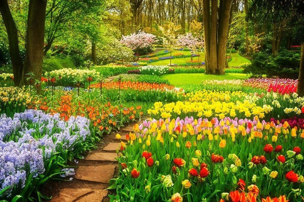
As a commercial property owner, you likely know how impactful landscaping design can be when it comes to impressing your occupants, visitors, and customers. A beautiful exterior landscape has an absolutely enormous influence on the success of your business, and one of the most effective and economical ways to upgrade your landscape is with seasonal color flowers
Colors have been shown to significantly influence human emotion, take the red and yellow of the McDonald’s sign for instance, and utilizing seasonal flowers, with their wide array of colors, can have a similar effect. But how do you select flower colors that look good together or that will help accomplish the desired effect you want to impart on those living and working within your property? Read on below for a handy guide on how to select the best seasonal flowers for your building.
Color Selection Principles
At first, selecting the seasonal color plants and flowers for your property may seem like a daunting task, but it certainly doesn’t have to be. The first thing to realize is that the colors you select should reflect your values, and with a little understanding of how certain colors can influence certain emotions, you’ll have an easy and fun time selecting the colored flowers and plants that evoke the sensibility that you’re promoting on your property.
When juxtaposed with the building itself, along with the general foliage, trees, grass, and soil, these pops of color are far from intrusive – they blend harmoniously into the background of your property to create a very specific vibe. It’s amazing to see the effect of just utilizing these types of flowers on your property. You’ll notice that visitors will linger a little longer, tenants will end up taking better care of the property and having a sense of pride for the place they inhabit, and prospective customers will be attracted to the overall look of your property.

Color Wheel
If you’ve ever opened a box of crayons or colored pencils as a kid, you’re probably familiar with the concept of the color wheel. Landscape architects, in fact, use this very concept on a regular basis when planning any outdoor environment, particularly one that involves commercial flower selection. To refresh your memory of the color wheel, we’ll go over some of the basics and nuances below:
- Primary Colors: Red, yellow, and blue are the basic light refractions from which all other colors are created. They don’t touch each other on the color wheel, but rather contrast each other and work with the secondary colors to form every possible shade of flower you could choose from.
- Secondary Colors: Orange, green, and violet sit next to primary colors and appear across from one another on the color wheel. These colors are byproducts of the combination of two of the primary colors. For example, yellow and blue combine to form green.
That’s an incredibly simplified version of a color wheel, and there is quite a bit more that you’ll need to know when selecting colors. Here are some additional aspects of color selection that landscapers use when making decisions:
- Hues: Every color is technically a hue. This is just terminology that allows you to dive deeper into the wide variety of color combinations on the wheel.
- Warm Colors: This refers to colors like yellow, orange, and red that are exciting and “look” warm.
- Cool Colors: Cool colors evoke water, sky, and grass. These are calming colors such as blue, green, and violet.
- Bright Colors: Brightness can be applied to both warm and cool colors. It’s more a reference to the color’s intensity. Think of an electric blue or a bright orange. Combining bright colors is a great tactic in spring and summer, as they amplify one another and contrast greatly with the greens and browns of the landscape.
- Soft Colors: Soft colors are easier on the eyes than bright colors and have a more passive, calming effect. As summer turns to fall, landscapers tend to transition into these types of colors.
- Value: Value refers to the ratios of color brightness to softness. For example, on the color wheel black and white are opposites – black being the absence of all colors and white being the presence of all colors. The value of color lies somewhere in between.
- Intensity: Intensity is another word for brightness, which is a huge key to color selection depending on the season. For example, most landscapers will use more intense color combinations in the Spring and Summer, and then lower the intensity as Summer wanes into Fall.
Seasonal Flower Color Schemes
So now that you understand the basics of the color wheel, how do you choose flower colors that look good together and are appropriate for the season? The next time you look at a seasonal flower landscape at a property you admire, you’ll notice the landscaper intentionally chose a specific color scheme, rather than randomly planting a bunch of nice-looking flowers.
So how do you plan out the landscape beforehand and create a design scheme? It’s almost a certainty that the landscaper used one of the six standard flower arrangement schemes, and you can use these same schemes too as a template for your landscaping plan.
- Monochromatic: Also called “mono,” this scheme involves using colors only within the same range of hues with variations in intensity and value. For example, a variety of different orange-colored flowers would constitute a monochromatic effect for the summer, and a variety of white flowers would look perfect for late Fall. These flower pairings have a pleasantly harmonious look to them.
- Complimentary: Complimentary refers to using opposite colors to contrast one another, such as blue and orange or purple and yellow.
- Analogous: Analogous pairings refer to colors that sit next to one another in the color wheel. This creates a blending effect, rather than a contrasting effect. For example, red and violet are analogous colors and make a lovely pairing.
- Primary: As you can likely guess, primary schemes involve only using primary colors, and they look fantastic during the mid-Summer. This is a tried and true tactic when the days are long, and it’s perfect for planting in entryways.
- Riotous: This is basically a free-for-all, with any color on the spectrum able to be incorporated. This looks especially good within the confines of a hanging flower basket, as the small area can counterplay with the chaotic mix of color.
- Pastel: Soft and more muted colors make up the pastel schemes, and these are great in early spring or late fall. You can see this working in lower light areas where pale pinks and yellows do particularly well.
Utilizing these schemes as a guide can make it a lot easier to put together a landscape incorporating seasonal color flowers that looks inviting and can really augment the perception of your exterior property.

Ideal Location Choice
When it comes to choosing a location, it’s important to look at the property in its entirety rather than focusing only on one specific location. Professional landscape designers know this very well, and they understand how your investment in landscaping will show through from season to season.
One of the most important aspects of location is utilizing your anchor plantings – in other words, plants that stay in place year-round – to work in concert with your seasonal flowers. Your seasonal flower plantings, in other words, “annuals,” should work to highlight and augment the aesthetic of your anchor plants.
Sun exposure is another major key to figuring out where to plant specific seasonal flowers. When planning out your planting, you need to know which plants thrive in direct sunlight and which don’t. Planting a shade-loving annual will burn if placed in direct sunlight for too long. The opposite is also true of certain annuals that need as much sunlight as possible.
Conclusion
If you’re looking for help with your seasonal flower planting, Earth Development has extensive landscape design experience in Wisconsin. Contact our experts to design your commercial landscape with seasonal flowers color schemes in mind, and you’ll be amazed at the positive impact it has on your property!
